I know, I know–you get those really great reports at the end of the year with all your blog stats just like I do. I know you all celebrated your page views and comments just like I did. And I know you marveled at the really pretty map that showed you were all your views came from, just like I did.
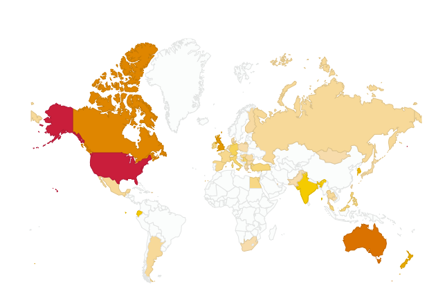
It’s been a while since I looked at my origins map (mostly because I just figured out today that I turned it off on my dashboard! Oops!), and so it was all the more amazing to me when I saw this map. Now it’s from the time period between February 2012 and now, so it’s not just last year, but it was SO STINKING COOL I had to share it:
 I wish I could copy the list of the names of all of those places –it’s CRAZY! Qatar? Singapore? St. Kitts? Bosnia and Herzegovina? Egypt? Seriously? I could go on and on about how unbelievable it is to me that the words I write in Missouri can reach so far around the world. What a fabulous picture of the connectedness and “flatness” (as many have come to call it) of the world today! I can’t wait to show my friends in my class this graphic, and inspire them to impact the world with their words. We often talk about how you never know who your audience is when you’re blogging, and this is proof that that audience is probably even bigger than you can imagine!
THANK YOU to all of you from these fabulous places for taking time to read what I write! I am humbled and thankful for you. 🙂
What did your end of year graph look like? What country was the most amazing or surprising to you? Tell me about it! I’d love to celebrate with you. 🙂
